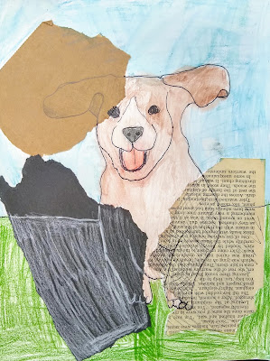
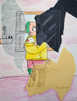
The National Visual Arts Standards are a set of goals created by visual arts educators working with colleagues across the field of arts education. They provide guidelines and expectations for what students should know and be able to do throughout Kindergarten to 12th grade in their state. Two of the standards are to "Individually or collaboratively formulate new creative problems based on student's existing artwork" and to "Reflect on, re-engage, revise, and refine works of art..." Keeping these in mind, students in High School Art II & III either did a new version of one of their past works of art or added to, changed, or created something new from an existing past work of art. Enjoy their before and afters (the top photo for each student is their "before")!
(Click on each photo to see more closely.)
 |
| by Miranda L. |
I chose to do these wings because I didn't like how they turned out the first time. I just kept the picture black and white.
 |
| by Madelyn K. |
I chose my vertebrae drawing to redo because it had no background so I wanted to make it a part of something with more depth. I chose "variety" as my art element because it adds a contrast from the first assignment and looked really cool to add many different mediums to make one piece. I definitely feel more satisfied with this piece. It's probably one of my favorites.
 |
| by Emmett M. |
I chose this piece of art because the original was terrible. The background was a mess, and the skull's shading was messy. The new one isn't as dark and I added some color. It still can be improved, but it is better than the original. I drew an amazing sketch in my sketchbook [which I like better than both of these].
 |
| By John M. |
For my project I chose to rework a "final" project I did for Freshman year art. I never got to truly express that piece of art, so it had been a pain in my side for years, until now! I initially didn't think about which Art Element or Design Principle I would focus on, but I definitely put a lot of color, balance, and emphasis. I feel so much more satisfied with my artwork than it was before and it may be one of my best this year!
 |
| by Paul S. |
I decided to finish this piece because I loved this idea and never got to finish it. I did this shoe in honor of my great grandfather who survived Vietnam. The only thing I wish I could have done better was to add more blue on the rest of the shoe.
 |
| By Jaxon B. |
I chose to redo this art project because I had never actually done everything I wanted to do for it. The biggest thing that it was lacking was some texture on the surface of the planet. I also really did not like the bright orange color of the planet's surface that the spacecraft was coming down on because it looked more like it was landing on a star than a planet. I did not want to edit the spacecraft itself because it had been done very intricately and I did not want to mess this up. Hopefully my work has caused an improvement to a project that I have wanted to build upon for so long.
 |
| By Kyler M. |
I've drawn Frank Ocean an award winning 2016 Best Album (Blond). It is made of pencil and paper using different styles of shading. Probably one of my best drawings, honestly.
 |
| By Julien S. |
I chose to remake an old sketchbook entry for my project. I wanted to recreate it with a different medium that is more difficult for me. It's fun to compare the difference.
 |
| By Jaron M. |
I always felt that I could've done more to this project so I decided to do a 9th grade present. This was an interesting blast from the past that made a 9th grade me mix with 10th grade me.
 |
| By Teagan M. |
For this project I decided to redesign an animal I made in 2018. It looks like a mix between a cat, a fox, a bird, and an angler fish.
 |
| By Emily P. |
I chose an artwork from the 7th grade that I remember being very proud of at the the time. I decided to rework it with my favorite medium [digital art] and focus on color emphasis. I feel much happier with how my art looks now and how much I've improved over the years.
 |
| By Hope T. |
I remade an art project I did in middle school. I painted over the markers in acrylic to give it a more vibrant look and added white accents to make it look more appealing. I also tried to make it more symmetrical than the original.


