Students in Art II & III learned about Jackson Pollock who was a pioneer in the Abstract Expressionism movement. We learned how this type of art expresses feelings and ideas in a different way and often is created without any kind of forethought or planning. They then got to try their hand at being Abstract Expressionistic painters themselves. Some enjoyed the process and wanted to create more than one and some weren't so sure about it. Either way, their masterpieces are fun to look at! They each gave their work a title and an artist statement to go with it.
(Click on each photo to see more closely.)
Autumn Confusion by Grace O.
One reason why I chose the colors shown is because I was going for an autumn look, hence the "Autumn Confusion." The title also shows what I felt while doing my painting.
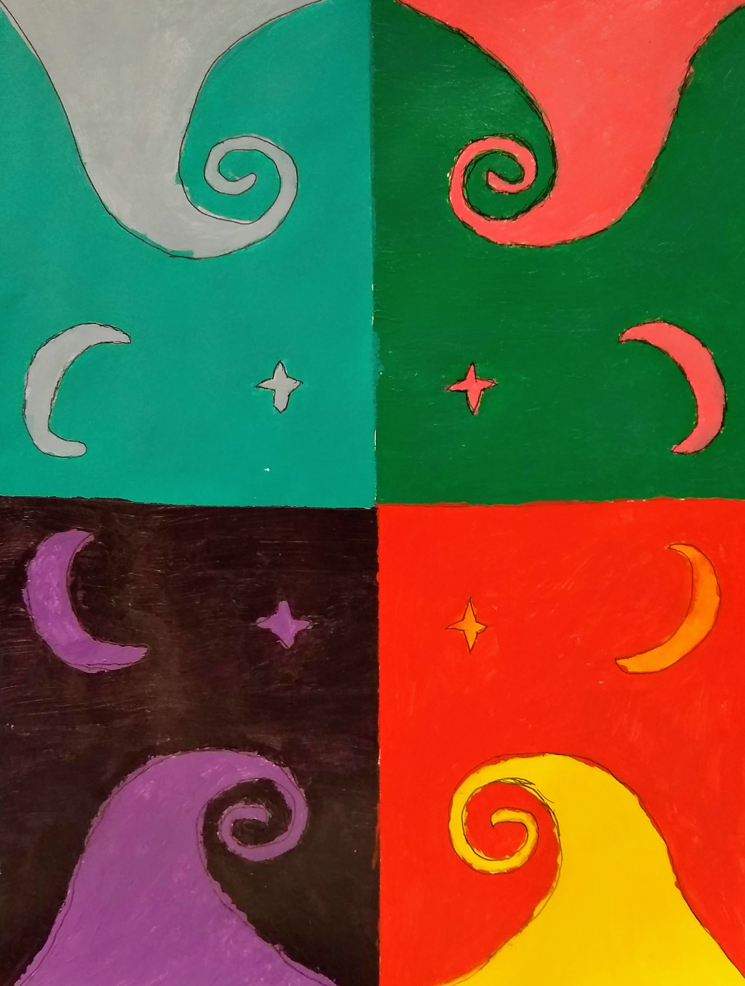
"A Big Galaxy" by Grace O.
I chose this idea because I like splattering the white paint to make it look like stars. It shows the world outside of ours.
Mess by Michelle B.
Sometimes I'm a very messy person. While making this it was definitely one of those times.
Jubilance by Zoe S.
I picked this style because I was trying to portray the emotion of excitement. I chose the title because it means excitement and I chose the colors because they're very bright and exciting with subtle hints of dark colors.
The Love of My Life by Mallory W.
What inspired this piece was my love of Barry B. Benson. I chose black and yellow to represent Barry's glorious stripes. I put flicks of white paint because when I stare into his beautiful eyes I think of a galaxy of stars. Barry is my one and only. I will treasure him forever.
A Hint of Frosting and Contemplation by Rachel R.
I chose the colors on this painting because I really like Payne's gray. The pink is my favorite because it reminds me of frosting. I enjoyed this abstract art because it challenged me NOT to think and to just go with the flow. I didn't try to embody an emotion or idea because (as I have learned) sometimes simple things make a big impact.
"I Don't Know, Man" Josiah 2021 by Stephen H.
In this painting, I used crimson, scarlet, permanent black, and lake blue. I titled this painting "I Don't Know, Man" because that's what my friend said when I asked him what it was. When I was painting I noticed the reds and blue mixing together to make a dark purple color.
"Springtime in Chaos" by Julia L.
I tried to keep my colors light and exciting. I didn't really know what I was doing till I was done. I tried to use movement but I don't know how successful it was.
"The Firey Death of My Sanity" by Julia L.
"Surprise!" by Elizabeth (Maddie) B.
I chose the word Surprise to demonstrate because I love being surprised. The best surprise I have ever received was a horse for my sixteenth birthday!
"The Massacre" by David M.
I had no plan in mind so I threw a lot of paint together.
"Nightfall" by Vivian M.
My inspiration for this artwork was a stormy sky.
"The Graffiti" by Josiah T.
I made my painting like this because I've always like the way splatters looked and I named it "Graffiti" because it looks like graffiti.
"Moledro" by Teagan M.
I chose to make my abstract painting inspired by the emotion called moledro, which can be described as "a feeling of resonant connection with an author or artist you'll never meet."